Choosing an exterior house paint color can feel overwhelming at first—there are so many options, and the stakes feel high since it’s such a visible, long-term decision. But when you break the process down into a few clear, manageable steps, it becomes much less stressful and far more enjoyable. Instead of guessing or relying on how a color looks on a tiny swatch, you can make thoughtful choices based on your home’s features, surroundings, and lighting. Taking this approach helps you avoid costly mistakes and gives you confidence that the final result will look cohesive, polished, and just as good in real life as you imagined.
Step 1 – Start with what you can’t change
Look at fixed elements of your home:
- Roof (shingles, metal color)
- Brick or stone
- Driveway and pathways
- Landscaping
Your paint should coordinate with these, not fight them. For example, a warm-toned roof pairs better with creamy whites, tans, or warm grays—not cool blue-grays.
Step 2 – Consider your home’s style
Certain colors naturally fit certain architectural styles:
- Traditional / Colonial → whites, grays, navy, muted tones
- Modern → high contrast (black & white), charcoal, clean neutrals
- Craftsman → earthy tones (olive, rust, beige)
- Farmhouse → white, off-white, soft gray with dark accents
You don’t have to follow rules strictly—but going too far outside them can look off.
Step 3 – Look at your surroundings
Your house doesn’t exist in isolation:
- In leafy areas → greens, taupes, and warm neutrals blend nicely
- In urban areas → bolder contrast can work
Check nearby homes so you stand out just enough, not clash
Step 4 – Always test in real life (this is critical)
Paint looks wildly different outside, especially in the sun.
Do this:
- Buy sample quarts
- Paint large swatches on multiple sides of your house
- Check at morning, noon, and evening
Sunlight, shade, and even nearby trees will change how it looks.
Step 5 – Think about undertones
This is where most people go wrong. A “gray” might actually lean blue, green or purple
Compare samples side-by-side to spot undertones before committing.
Step 6 – Keep it simple
Too many colors can make a house look busy. A clean, cohesive palette almost always looks more expensive and timeless.
Popular exterior color combos (that consistently work)
White + black trim + wood door
Light gray + white trim + charcoal accents
Beige/tan + cream trim + dark brown accents
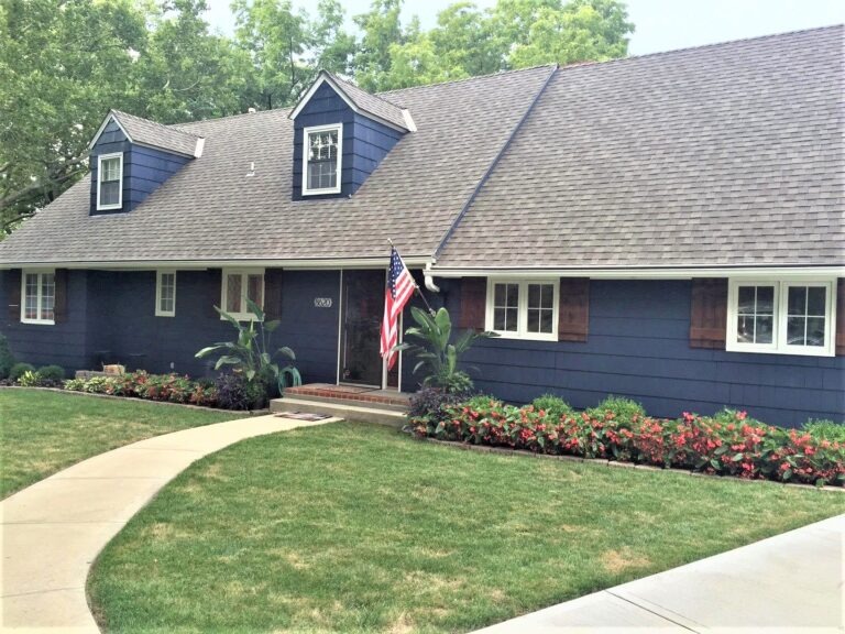
Navy blue + crisp white trim
By considering your home’s features, surroundings, lighting and testing colors in real life you can confidently choose a color that looks cohesive and works well beyond just a small paint sample.